Would a local business be willing to hire a teacher for one day a month as a means of closing a school district budget shortfall?
Would a teacher be willing to work one day a month at someplace other than their classroom as an alternative to a pay cut or termination?
The revenue pie continues to shrink. No matter how you cut it, there is simply less money to fund public services. States and school district are increasingly using furloughs, unpaid days off, as a budget cutting tool. Cutting five employee work days from a 180 day school calendar yields a salary reduction of 2.8%. There is an alternative mechanism that would potentially achieve the same, or even more cost savings, and also allow teachers to avoid a pay cut: RENT-A-TEACHER.
The responsibility of any employee is to perform tasks that are requested by their employer. If the employer sends the employee off site to work at another location, then it is the employee’s responsibility to do so, especially if that employee receives the same pay.
In the RENT-A-TEACHER program, teachers (and other school staff) would work at local employers a few hours a month. Participating employers would pay the school district for the teacher’s time. For example, the teacher might leave school after lunch for four hours on a Friday afternoon to work at a local business. A student teacher would cover during that time. (The student teacher could also be rented out.)
Businesses would pay an hourly Teacher Rental Fee (e.g. $20/hour.) This would be for the teacher’s salary only. The school district would maintain the teacher’s benefits, and continue to pay the teacher their full salary (e.g. $35/hour.) Businesses not only contribute to the school but also receive the benefit of the productive work provided by teachers they hire.
Participating businesses that employ teachers for a few hours a month would receive public recognition for doing so. Since most people are very supportive of teachers, this program would provide an incentive for people to shop and spend more money locally. This would preserve the local tax base, increase revenues of local businesses, and likely result in local job creation.
RENT-A-TEACHER is an example Tax Payment Choice. Since this new revenue stream goes towards the school budget, treat the Teacher Rental Fee as a form of direct tax payment that is credited to the tax assessments or fees of that business. (TEACHER-RENTAL-IN-LIEU-OF-TAXES) Give businesses a choice in how they pay their taxes, and they will do so in a manner that helps stabilize school funding.
Below are examples of revenues that the RENT-A-TEACHER program might generate for schools. I used round numbers, based upon an equivalent 40 hour work week, to get to an estimated teacher salary of $35/hr for the 36 week school year. The attachment includes data and graphs for several hourly teacher rental rates. You can work with the numbers and come up with your own scenarios.
(Click here to download a full analysis of the potential school revenues that might be realized from the RENT-A-TEACHER program.)
*****STARTING ASSUMPTIONS FOR HYPOTHETICAL STATE PUBLIC SCHOOL SYSTEM*****
NUMBER OF TEACHERS: 50,000
AVERAGE TEACHER SALARY: $50,000
TOTAL STATE TEACHER SALARIES: $2,500,000,000
———
**WEEKS/SCHOOL YEAR: 36
STATE SALARY $COST/SCHOOL WEEK: $69,444,444
AVERAGE WEEKLY TEACHER SALARY: $1,400
———
**SCHOOL YEAR DAYS: 180
STATE $COST/SCHOOL DAY: $13,888,889
AVERAGE DAILY TEACHER SALARY: $278
———
**SCHOOL YEAR HALF-DAYS: 360
STATE $COST/SCHOOL HALF-DAY: $6,944,444
AVERAGE HALF-DAY TEACHER SALARY: $139
——–
HOURS/ SCHOOL DAY: 8
HOURS/ SCHOOL WEEK: 40
HOURS/SCHOOL YEAR: 1440
STATE $COST/SCHOOL HOUR: $1,736,111
AVERAGE HOURLY TEACHER SALARY: $35
====================================
SCHOOL DAYS: 180
PROPOSED WORK DAY REDUCTION: 5
PERCENT SALARY REDUCTION: 2.8%
====================================
*****EXAMPLES OF SIMILAR PERCENTAGE SALARY SAVINGS FROM RENT-A-TEACHER*****
HOURLY TEACHER RENTAL RATE: $10/hr
AVERAGE TEACHER RENTAL HOURS PER WEEK: 4.0
WEEKLY SALARY SAVINGS PER TEACHER: $40
PERCENT SALARY SAVINGS: 2.9%
ESTIMATED ANNUAL STATE BUDGET SAVINGS: $71,428,571
===============================================
HOURLY TEACHER RENTAL RATE: $15/hr
AVERAGE TEACHER RENTAL HOURS PER WEEK: 3.0
WEEKLY SALARY SAVINGS PER TEACHER: $45
PERCENT SALARY SAVINGS: 3.2%
ESTIMATED ANNUAL STATE BUDGET SAVINGS: $80,357,143
===============================================
HOURLY TEACHER RENTAL RATE: $20/hr
AVERAGE TEACHER RENTAL HOURS PER WEEK: 2.0
WEEKLY SALARY SAVINGS PER TEACHER: $40
PERCENT SALARY SAVINGS: 2.9%
ESTIMATED ANNUAL STATE BUDGET SAVINGS: $71,428,571
===============================================
HOURLY TEACHER RENTAL RATE: $25/hr
AVERAGE TEACHER RENTAL HOURS PER WEEK: 1.5
WEEKLY SALARY SAVINGS PER TEACHER: $37.50
PERCENT SALARY SAVINGS: 2.7%
ESTIMATED ANNUAL STATE BUDGET SAVINGS: $66,964,286
===============================================
HOURLY TEACHER RENTAL RATE: $30/hr
AVERAGE TEACHER RENTAL HOURS PER WEEK: 1.5
WEEKLY SALARY SAVINGS PER TEACHER: $45
PERCENT SALARY SAVINGS: 3.2%
ESTIMATED ANNUAL STATE BUDGET SAVINGS: $80,357,143
===============================================
HOURLY TEACHER RENTAL RATE: $35/hr
AVERAGE TEACHER RENTAL HOURS PER WEEK: 1.0
WEEKLY SALARY SAVINGS PER TEACHER: $35
PERCENT SALARY SAVINGS: 2.5%
ESTIMATED ANNUAL STATE BUDGET SAVINGS: $62,500,000
===============================================
HOURLY TEACHER RENTAL RATE: $40/hr
AVERAGE TEACHER RENTAL HOURS PER WEEK: 1.0
WEEKLY SALARY SAVINGS PER TEACHER: $40
PERCENT SALARY SAVINGS: 2.9%
ESTIMATED ANNUAL STATE BUDGET SAVINGS: $71,428,571
===============================================
HOURLY TEACHER RENTAL RATE: $45/hr
AVERAGE TEACHER RENTAL HOURS PER WEEK: 1.0
WEEKLY SALARY SAVINGS PER TEACHER: $45
PERCENT SALARY SAVINGS: 3.2%
ESTIMATED ANNUAL STATE BUDGET SAVINGS: $80,357,143
===============================================
HOURLY TEACHER RENTAL RATE: $50/hr
AVERAGE TEACHER RENTAL HOURS PER WEEK: 1.0
WEEKLY SALARY SAVINGS PER TEACHER: $50
PERCENT SALARY SAVINGS: 3.6%
ESTIMATED ANNUAL STATE BUDGET SAVINGS: $89,285,714
===============================================
 100 YEARS ON A PAGE BLANK.pdf
 100 YEARS ON A PAGE EXAMPLE.pdf
 State Pension Funds Expense_Return Comparison
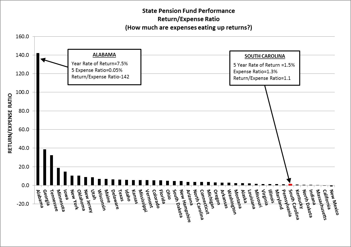